Month: March 2021


  • MLB GOAT: Evaluating a Baseball Player

    MLB GOAT: Evaluating a Baseball Player

    My last post, which covered an introductory example of adjusting century-old stats for inflation in the MLB, was the first step is a larger goal, one that will be brought to life with the processes I’ll outline today: ranking the greatest MLB players ever. Many times before we have seen an attempt to do so, but rarely have I found a list that aligns with my universal sporting values. Thus, I have chosen to embark on a journey to replicate the results in a process I see to be more philosophically fair: a ranking of the best players of all time with the driver being the value of their on-field impact. However, as I am a relative novice in the art of hardcore analysis in baseball, I’ll be providing a clear, step-by-step account of my process to ensure the list is as accurate as possible.

    The Philosophy

    I’ve come to interpret one universal rule in player evaluation across most to all team sports, which relies on the purpose of the player. As I’ve stated in similar posts covering the NBA, a player is employed by a team for one purpose: to improve that team’s success. Throughout the course of the season, the team aims to win a championship. Therefore, the “greatest” MLB players give their teams the best odds to win the World Series. However, I’m going to alter one word in that sentence: “their.” Because championship odds are not universal across all teams (better teams have greater odds), that means a World Series likelihood approach that considers “situational” value (a player’s value to his own team) will be heavily skewed towards players on better teams, and that would be an unfair deflation or inflation of a player’s score that relies on his teammates.

    The central detail of my evaluation style will be the ideology behind assigning all players the same teammates, average teammates. Therefore, the question I’m trying to answer with a player evaluation is: what are the percent odds a player provides an average team to provide the World Series? This approach satisfies the two conditions I outlined earlier: to measure a player’s impact in the way that appeases the purpose of his employment while leveling the field for players seen as “weaker” due to outside factors they couldn’t control. Thus, we have the framework to structure the evaluations.

    The Method

    To measure a player’s impact, I’ll use a preexisting technique I’ve adopted for other sports, in which I estimate a player’s per-game impact (in this case, this would be represented through runs per game). For example, if an outfielder evaluates as a +0.25 runs per game player on offense and a 0 runs per game player on defense, he extends the aforementioned average team’s schedule-adjusted run differential (SRS) and thus raises the odds of winning a given game with the percent odds that come along with a +0.25 SRS boost. To gain an understanding of how the “impact landscape” works, I laid every qualified season from 1871 to 2020 out for both position players and pitchers to get a general idea of how “goodness” translates to impact. These were the results:

    Note: Offense and fielding use Fangraphs‘s “Off” and “Def” composite metrics scaled to per-game measures while pitching uses Runs Above Replacement per game scaled to “runs above average” – these statistics are used to gauge certain levels of impact. / I split the fielding distributions among positions to account for any inherent differences that result from play frequency, the value of a position’s skill set, and others.

    Offense (all positions)

    Fielding (pitchers)

    Fielding (catchers)

    Fielding (first basemen)

    Fielding (second basemen)

    Fielding (third basemen)

    Fielding (shortstops)

    Fielding (outfielders)

    Pitching (starters)

    Pitching (relievers)

    A large reason for the individual examination of each distribution is to gain a feel for what constitutes, say, an All-Star type of season, an All-MLB type of season, or an MVP-level season, and so on and so forth. The dispersions of the distributions are as listed below:

    Standard DeviationsPosition Players (Off)Starting Pitchers (Pitch)Relief Pitchers (Pitch)Pitchers (Field)Catchers (Field)First Basemen (Field)Second Basemen (Field)Third Basemen (Field)Shortstops (Field)Outfielders (Field)
    -4-0.554-1.683-0.582-0.305-0.262-0.255-0.256-0.258-0.258-0.286
    -3-0.402-1.262-0.437-0.233-0.183-0.202-0.185-0.188-0.178-0.221
    -2-0.250-0.841-0.291-0.162-0.104-0.149-0.115-0.118-0.097-0.157
    -1-0.098-0.421-0.146-0.090-0.025-0.096-0.044-0.048-0.017-0.092
    00.0540.0000.000-0.0180.053-0.0430.0260.0220.064-0.028
    10.2060.4210.1460.0530.1320.0100.0970.0920.1440.037
    20.3580.8410.2910.1250.2110.0630.1680.1620.2250.102
    30.5101.2620.4370.1970.2900.1160.2380.2320.3050.166
    40.6621.6830.5820.2690.3680.1690.3090.3020.3850.231

    These values are used to represent four ambiguous “tiers” of impact, with one standard deviation meaning “good” seasons, two standard deviations meaning “great” seasons, three standard deviations meaning “amazing” seasons, and four standard deviations meaning “all-time” seasons, with the negative halves representing the opposites of those descriptions. Throughout my evaluations, I’ll refrain from handing out all-time seasons, as these stats were taken from one-year samples and are thus prone to some form of variance. Therefore, an “all-time” season in this series will likely be a tad underneath what the metrics would suggest.

    There are also some clear disparities between the different fielding positions that will undoubtedly affect the level of impact each of them can provide. Most infield positions seem to be above-average fielders in general, with the first basemen showing greater signs of being more easily replaced. The second and third basemen share almost the same distribution while the shortstops and catchers make names as the “best” fielders on the diamond. I grouped all the outfielders into one curve, and they’re another “low-ceiling” impact position, similar to pitchers (for whom fielding isn’t even their primary duty). It’ll be important to keep these values in mind for evaluations, not necessarily to compare an average shortstop and an average first baseman, but, for instance, an all-time great fielding shortstop versus and an all-time great fielding first baseman.

    The Calculator

    Now that we have the practice listed out, it’s time to convert all those thoughts on a player to the numeric scale and actually do something with the number. The next step in the aforementioned preexisting technique is a “championship odds” calculator that uses a player’s impact on his team’s SRS (AKA the runs per game evaluation) and his health to gauge the “lift” he provided an average team that season. To create this function, I gathered the average SRS of the top-five seeds in the last twenty years and simulated a Postseason based on how likely a given team was to win the series, calculated with regular-season data in the same span.

    Because the fourth seed (the top Wild Card teams) is usually better than the third seed (the “worst” division leader), and the former would often face the easier path to the World Series, a disparity was created in the original World Series odds: in this case, a lower seed had better championship odds. To fit a more philosophically-fair curve, I had to take teams out of the equation and restructure the function accordingly. This means there is a stronger correlation to title odds based on SRS, separate from seeding conundrums; after all, we want to target the players with more lift, not the other way around. Eventually, this curve became so problematic I chose the more pragmatic approach: taking and generalizing real-world results instead of simulating them and found the ideal function with an R^2 of 0.977. (This method seemed to prove effective not only because of the strength of the fit, but the shape of the curve, which went from distinctly logarithmic (confusing) to distinctly exponential.)

    The last step is weighing a player’s championship equity using his health; if a player performed at an all-time level for 162 games but missed the entirety of the Postseason, he’s certainly not as valuable as he would’ve been if he’d been fully healthy. Thus, we use the proportion of a player’s games played in the regular season to determine the new SRS, while the percentage of Postseason games played represents the sustainability of that SRS for the second season. The health-weighted SRS is then plugged into the championship odds function to get Championship Probability Added!

    Significance

    With my new “World Series odds calculator,” I’ll perform evaluations on the best players in MLB history and rank the greatest careers in history. I’ll aim to rank the top-20 players ever at minimum, with a larger goal of cranking out the top-40. With this project, I hope to shed some light on these types of topics in a new manner while, hopefully, sparking discussion on a sport that deserves more coverage nowadays.


  • How Different Would Hugh Duffy’s 1894 Batting Title Look in 2020? – MLB Stat Inflation

    How Different Would Hugh Duffy’s 1894 Batting Title Look in 2020? – MLB Stat Inflation

    During the 1894 MLB season, Hugh Duffy of the Boston Beaneaters set a new precedent for contact hitters, posting an outstanding .440 batting average. This record has yet to be broken and will likely never be. Naturally, this sets forth the idea of questioning how valuable Duffy’s average truly was. What would a .440 hitter in 1984 have looked like if he played at the same level during, say, 2020? Here, I’ll use a technique to prorate Duffy’s batting average to an environment closer to the one batters play in today as an introductory example to accounting for stat inflation in the MLB, as well as to gain some more insight as to how impressive Duffy’s 1894 campaign really was.

    The Method

    To standardize batting average across eras, we need to set a baseline for the hitting environment. Because we’re adjusting stats closest to the 2020 season, I’ll choose values that are very similar to today’s to allow for more intelligible comparison. Last season, the MLB’s cumulative batting average was .245, a mere half-percent less than the “conventional average” of .250, so for these standardized values, we’ll set the typical batting average as such. The next point of consideration is the dispersion of our ideal batting averages, which will be measured with a conceived standard deviation. There are two options for us here:

    • Measure the standard deviation using all players with at least one at-bat.
    • Measure the standard deviation using all qualified hitters ( 3.1+ plate appearances per team game).

    It may seem there wouldn’t be a significant change, but in taking one of the other, the standard deviation will vary by roughly 10%. For example, in 2019, the standard deviation of batting average using the first method would draw a value of roughly 13.5%. The second method garners a typical variance of 2.6%. Because the distribution of batting average looks approximately normal, I’m inclined to use the second method. It also makes sense to think a “good” hitter (one standard deviation above the mean) would hit roughly .280, a “great” one would hit about .310, and a .340 hitter would be in contention for the batting title. Thus, we’ll set the parameters of our standardized batting curve to a mean of .250 and a standard deviation of 3%.

    There was also one more variable that I suspected would play a role in a fair cross-era comparison. (This is concerning cumulative stats such as hits or home runs). League offenses were far more efficient on a per-game basis in 1894 (7.38 runs per game) than in 2020 (4.65 runs per game). This could potentially mean a quicker flow of offense during 1894 granted its players far more opportunities per game than in 2020. Thus, I calculated a figure I’ll call “pace,” the number of plate appearances every nine innings. (I chose to use nine innings rather than one game because per-game stats will be affected by extra-inning games.) During the 1894 season, there were about 43.0 plate appearances every nine innings whereas, in 2020, there were 39.8. This may not seem to be a significant factor, but it could be the difference between four and five plate appearances in a game for the cleanup hitter.

    Duffy’s New Average

    During the 1894 season, the “placeholder” standard deviation was absurdly high compared to its 2020 counterpart, making Duffy’s .440 batting average less impressive on our standardized scale. By taking the z-score of his batting average, we obtain a value of +3.825, which on the standardized scale, is…

    *drum roll please*

    … a new average of .365! This means that if Duffy were to have played at the same level in a roughly 2020-esque environment, just under 36.5% of his at-bats would have resulted in a hit. This is still a very impressive feat, and Duffy would still claim the batting title among the 2020 contenders, but his hitting proficiency is closer to that of DJ LeMahieu last season (.364 average) than an outlier among outliers in MLB history.

    Significance

    It’s often well-known that batting averages in baseball will fluctuate over time, explaining why the superstars of the late 19th and early 20th centuries will post some averages greater than .400 while the very best of today will rarely exceed .350. However. there have been few attempts (that I’ve seen) to adjust for these changes to create a “Standardized Scale.” (From here on out, I will refer to these adjusted baseball statistics with a “z” abbreviation (alluding to the notation of the standardized test statistic)). So Duffy’s 1894 batting average of .440 correlates to a “z” BA of .365. My goal with these values is to help evaluate MLB players of the past in fair comparison to players of the present, to shed more light on the true capabilities of the greatest baseball players of all time.


  • Are the Brooklyn Nets the Title Favorites?

    Are the Brooklyn Nets the Title Favorites?

    After the minor blockbuster deal that relieved Blake Griffin of his athletic duties in Detroit and eventually landed him in Brooklyn, the world started to ask if his acquisition moved the needle even more for the Nets’ championship hopes. Naturally, this sets forth the question of Brooklyn’s Finals likelihood before the signing, and whether or not Griffin actually changes those odds.

    The Raw Numbers

    The aggregate Brooklyn Nets team so far, meaning the inclusions of stints with and without the later additions like James Harden, is not on track to win the championship. With an SRS of +4.65 through their first 37 games, the Nets would be on track for 54 wins during a regular 82-game season (corresponds to a rough 65.5% win percentage). Compared to their actual win percentage of 64.9% (24 – 13), a small argument could be made that Brooklyn’s record is currently understating them, although the difference isn’t even enough to add an extra win to their “Pythagorean” record.

    Historically speaking, NBA teams don’t enter legitimate title candidacy with an SRS below +5. According to Ben Taylor’s CORP overview on Nylon Calculus: “Since Jordan returned in 1996, no healthy team has hung a banner with an SRS differential below 5.6 and only one (the ’03 Spurs) was below 6.6.” (This was written before the Raptors hung their own banner in 2019). This means, assuming Brooklyn doesn’t obtain some major catalyst for the second season, either in terms of roster development or team chemistry, they aren’t viable pick as the “title favorites.” However, these figures aren’t totally representative of how good the Nets are right now, as they included games before the addition of James Harden and all of them exclude the efforts that Griffin will bring to the table.

    Brooklyn with Harden?

    Because Griffin, a very good player in his own right, will make a lesser impact on the Nets than James Harden, the latter player is the more important focus when gauging the team’s championship likelihood. Harden’s larger role and greater influence on the scoreboard will resultantly have a more significant impact on whether or not Brooklyn eclipses the cluster of “good-not-great” teams and into championship contention.

    During the past, we’ve seen that bringing in more star talent is not additive. When the Golden State Warriors won 73 games in 2016 they were evidently a super-team, posting a +10.38 SRS and nearly claimed the title as the greatest team ever before falling to LeBron James’s Cavaliers in seven games (although I don’t think the Finals loss necessarily topples Golden State’s case, either). When they replaced (mostly) Harrison Barnes’s minutes with a peak Kevin Durant, they clocked in as a +11.35 SRS team in 2017. (We’re controlling for low-minute, replacement-level additions and subtractions as near negligible). Based on the historical distribution of Adjusted Plus/Minus data, a +1 player wouldn’t even be an All-Star level contributor. Does this mean Kevin Durant wasn’t even as good as a “sub” All-Star in 2017? Of course not. But his value to the Warriors was likely closer to that number than the same figure if he were on an average team.

    My “portability” curve estimates in which players are grouped into five tiers – the graph shows the change in per-game impact for a +4 player across all tiers and team SRS (x-axis) differentials greater than zero.

    This is why there were so many concerns surrounding James Harden’s arrival in Brooklyn. Would the immersion of so many offensive superstars, especially ones that lack some of the “portable” traits we saw succeed in Golden State, it was perfectly reasonable to suggest that diminishing returns would eventually kick in with the Nets and their offense would nearly plateau. But has this been the case? Through Harden’s first 23 games in Brooklyn, the offense has been scoring 123.3 points every 100 possessions with him on the floor, which would comfortably finish as the greatest team offense of all-time, as well as being a mark comparable to Curry and Durant’s team offenses in Golden State. But similar to those Curry-Durant lead teams, having a historically-great offense with stars on the floor doesn’t guarantee a championship (plus, Golden State fared very well in a department in which Brooklyn severely lacks: defense).

    With Harden off the floor, Brooklyn’s offense scores 116.3 points every 100 possessions: still a very good team offense, but not nearly as good when the Beard is checked in. Does this mean Harden contributes +7 points every 100 possessions to the Brooklyn Nets? Not necessarily. On-off ratings are highly influenced by how a team staggers its playing time, i.e. a player may spend all his minutes with the team’s stars or the team’s scrubs. However, if we comb through the Nets’ n-man lineups, we can gain insight as to how the additions and replacements of one of Durant, Harden, and Kyrie Irving would increase the team’s offensive heights.

    (? PBP Stats)

    It’s no surprise that the Nets’ offense is at the peak of its powers when Durant and Harden, the team’s two best offensive players, are on the court together, posting a whopping 126.4 offensive rating. Now let’s look at how Durant and Irving-led offenses fare: a similarly outstanding 121.8 points per 100. A five-point SRS difference could be the difference between near-locks and playoff contention; however, we’re already seeing a declination in Harden’s supposed influence on Brooklyn’s offense. But wait, there’s more! Let’s look at the Nets’ four-man units to further gauge Harden’s offensive value in Brooklyn.

    (? PBP Stats)

    There are some really interesting implications here. Using five of Brooklyn’s regulars, take a look at the Brooklyn offense without Kyrie Irving: still a great 120.1 offensive rating. If we take DeAndre Jordan, the worst offensive player, out of the lineup and replace him with Kyrie Irving, the offense only improves by +1.1 points every 100 possession. Even giving Irving the easier route using Jordan as the control rather than, say, Joe Harris, the diminishing returns effect is perfectly clear. Replicating the same exercise for Harden – looking at how good his offenses are compared to Jordan’s – we get an estimate of +5.7 points of offensive impact every 100 possessions. This is similar to what has been suggested so far and is thus no surprise. However, what is surprising is where Kevin Durant stands in this approach.

    With Brooklyn’s four best (healthy?) offensive players on the floor (the Big-3 and Joe Harris), they score an astronomical 126.9 offensive rating. Once again, with DeAndre Jordan in Durant’s place, we see that mark take a minor toll to a 126.7 offensive rating. Does this mean Durant is only worth +0.2 points every 100 possessions to the Nets’ offense? Of course not. It doesn’t only defy the rational suppositions we have on Durant’s value, but there is some level of confoundment here. The extenuating circumstances do permit leniency, but lots of observed basketball trends still hold here. However, this does relate to later ideas we’ll explore. Lastly, the most damning piece of evidence in favor of the “portability” conundrum is how Joe Harris falls into the equation. A low-demand, high-efficiency shooter – an ideal mold for a complementary offensive piece – would have some of these diminishing returns alleviated, right? It turns out that’s more than true.

    (? Backpicks – Do Joe Harris’s more “scalable” traits make him even more valuable to the Nets’ high-powered offenses than their stars?)

    Without Joe Harris in the lineup among these five players, Brooklyn’s offense hits a low at a 118.1 offensive rating. Similar to the “replacement-level” route used for the previous three players, let’s look at the “Big-4” offense once more: the same astounding 126.9 offensive rating. That means, relative to the game setting and substitution, Joe Harris was worth +8.7 points more to Brooklyn’s high-level offenses relative to DeAndre Jordan. Perhaps let’s even the playing field out more. With Kyrie Irving as the replacement player, Harris’s offenses are +2 points more efficiency every 100 possessions. This is a very significant indicator of Harris’s “portability” in the Nets’ lineups. Does this mean he’s a more valuable offensive player than Irving? Not necessarily, but it suggests Harris’s main department (scalability) raises the ceiling for these high-level offenses more than Kyrie Irving’s skills, which start to blend in after so much offensive talent is thrown into the mix.

    This is supported by single-year RAPM (Regularized Adjusted Plus/Minus). Most of the time, players like Durant (+2.17 ORAPM) and Irving (+2.37) are more valuable offensive players than Harris (+1.99), but the relatively small gap paired with our previous knowledge on the subject corroborates even more: once Brooklyn’s offense becomes astronomically good, using players’ scalable traits will raise the ceiling even more. This is antithetical to a player like Allen Iverson (AKA a “floor raiser”). But there’s still one unanswered question: why was James Harden seemingly a more valuable offensive player than Durant and Irving (but especially Durant). If Harden is the player being added to the preexisting roster, why doesn’t he experience many diminishing returns? The answer: load and role trade-offs.

    James Harden is comfortably the most ball-dominant of Brooklyn’s offensive stars, holding the ball for an average of 5.42 seconds per touch on 93.3 touches per game according to Synergy tracking data. Although there is a reduction from last season, as implied through the “portability” construct, this change wasn’t unexpected. Meanwhile, his teammates Durant and Irving clock in at 3.11 seconds per touch / 69.5 touches per game 4.44 seconds per touch / 75.1 touches per game, respectively. When Harden takes the load off Durant and Irving, he’s absorbing a significant amount of their offensive impact. So while Harden’s offensive impact didn’t change a whole lot, Durant’s and Irving’s did.

    “Portability” usually observes the “internal” changes, or how individuals fares in different environments, but the other half of that coin of how traits like ball-dominance affect the portability of teammates. These phenomena explain why Harden’s offensive impact is comparable to his role in Houston and why Joe Harris is arguably more valuable to extremely high-octane offenses than Kyrie Irving.

    So what about Griffin?

    A part of the beauty of interpreting the Blake Griffin trade is that, no matter how good he is with the Nets, his impact will become redundant. Whether he lets his injuries define his post-thirty era or transforms back into 2019 Blake Griffin, there’s simply a limited amount of offensive impact to go around. If Griffin were reminiscent of his early-2010s self, perhaps he’ll show notable ability to fit well alongside star talent; but based on his time with the Pistons, Griffin isn’t a very high-portability player. Thus, if I were Steve Nash and the Nets’ coaching staff, I wouldn’t slot Griffin into the starting lineup or into the lineup early on in the first quarter (because, contrary to popular belief, games are often won by building suitable leads in the first quarter). Instead, Griffin would better serve his purpose as an anchor of the second unit, depending on how good he is again because we still don’t have a very clear picture of that.

    Conclusively, regardless of the “goodness” Griffin brings to the table, he’ll be spending too much time alongside too many offensive superstars with too little defensive equity, and his value to the Nets won’t be especially significant given his minutes aren’t drastically staggered against the starters’ playing time. With all this information processed, there’s now a clearer picture as to where they stand in the current playoff picture. Given the trade-offs between Durant’s, Harden’s, and Irving’s offensive impact, we can’t expect Brooklyn’s offense to be that much better. (The loss of defensive shares in the Harden trade is why I still think Brooklyn would’ve been better off refraining.) Due to the unstable state of the team defense (looking to approach well-below-average), the team’s regular-season SRS will likely max out at +5, and I could see a top-three seed as perfectly reasonable – Brooklyn is still a very good team!

    And the Playoffs?

    During the postseason, Kevin Durant will have the same luxury he did with the Warriors: acting as the secondary offensive star. The stress taken of his load between OKC and Golden State explains a lot of the stat inflation during the 2017 and 2018 title runs, and thus, his scoring could thrive to a similar level. But then there’s Harden. As his load hasn’t changed too much, and his skills become more redundant in the second season, he’ll likely pose a similar threat compared to previous seasons (although the eased burden with more stars alongside him could open up more catch-and-shoot opportunities). Irving is just one more offensive threat to add to this equation and will continue to woo defenses away from overplaying one of the stars.

    The prospect of Brooklyn’s offense in the Playoffs is intriguing; however, the results we’ve seen so far make those ideas more of an “on paper” scenario. The applicability of this style has yet to materialize into firm action. The inevitable threat of facing above-average offenses will continue to deconstruct the Nets’ defense, and I don’t see a ton of evidence to suggest Brooklyn will notably improve from its +5 SRS caliber player during the regular season. Depending on how the Bucks and Sixers pan out in the second season, I could reasonably see the Nets in the NBA Finals, although this is more due to a subpar Eastern Conference than actual Finals-caliber play on their part. However, I’d really have to squint to see Brooklyn topple either of the healthy Los Angeles teams, and even teams like Phoenix would pose a legitimate threat.

    (? ClutchPoints)

    When all is said and done, I don’t expect to see the Nets lift the Larry O’Brien trophy. Based on the current landscape of the East, a Finals berth is not out of reason. Milwaukee and Philadelphia are legitimate threats, and although I favor the Nets over the 76ers, I think Milwaukee is entirely capable of pushing through. Based on my expectations for the Brooklyn Nets (+5 SRS), the odds they win the title would clock in at roughly 2.6%. But because the East is so depleted and I’m not 100% confident in that evaluation, my reasonable range for the Nets’ championship odds is between 3% and 7%. The lesson to preach: bet on the field.


  • How Do NBA Impact Metrics Work?

    How Do NBA Impact Metrics Work?

    The introductions of player-evaluation metrics like Player-Impact Plus/Minus (PIPM) and the “Luck-adjusted player estimate using a box prior regularized on-off” (yes, that is actually what “LEBRON” stands for) peddled the use of these metrics to a higher degree than ever. Nowadays, you’ll rarely see a comprehensive player analysis not include at least one type of impact metric. With a growing interest in advanced statistics in the communities with which I am involved, I figured it would serve as a useful topic to provide a more complete (compared with my previous attempts on the subject) and in-depth review of the mathematics and philosophies behind our favorite NBA numbers.

    To begin, let’s first start with an all-inclusive definition of what constitutes an impact metric:

    “Impact metrics” are all-in-one measurements that estimate a player’s value to his team. Within the context we’ll be diving into here, a player’s impact will be portrayed as his effect on his team’s point differential every 100 possessions he’s on the floor.

    As anyone who has ever tried to evaluate a basketball player knows, building a conclusive approach to sum all a player’s contributions in a single notation is nearly impossible, and it is. That’s a key I want to stress with impact metrics:

    Impact metrics are merely estimates of a player’s value to his team, not end-all-be-all values, that are subject to the deficiencies and confoundment of the metric’s methodologies and data set.

    However, what can be achieved is a “best guess” of sorts. We can use the “most likely” methods that will provide the most promising results. To represent this type of approach, I’ll go through a step-by-step process that is used to calculate one of the more popular impact metrics known today: Regularized Adjusted Plus-Minus, also known as “RAPM.” Like all impact metrics, it estimates the correlation between a player’s presence and his team’s performance, but the ideological and unique properties of its computations make it a building block upon which all other impact metrics rest.

    Traditional Plus/Minus

    When the NBA started tracking play-by-play data during the 1996-97 season, they calculated a statistic called “Plus/Minus,” which measured a team’s Net Rating (point differential every 100 possessions) while a given player was on the floor. For example, if Billy John played 800 possessions in a season during which his team held a cumulative point differential of 40 points, that player would have a Plus/Minus of +5. The “formula” for Plus/Minus is the point differential of the team while the given player was in the game divided by the number of possessions during which a player was on the floor (a “complete” possession has both an offensive and defensive action), extrapolated to 100 possessions.

    Example:

    • Billy John played 800 possessions through the season.
    • His team outscored its opponents by 40 points throughout those 800 possessions.

    Plus/Minus = [(Point Diff / Poss) * 100] = [(40/800) * 100] = +5

    While Plus/Minus is a complete and conclusive statistic, it suffers from severe forms of confoundment in a player-evaluation sense: 1) it doesn’t consider the players on the floor alongside the given player. If Zaza Pachulia had spent all his minutes alongside the Warriors mega-quartet during the 2017 season, he would likely have one of the best Plus/Minus scores in the league despite not being one of the best players in the league. The other half of this coin is the players used by the opposing team. If one player had spent all his time against that Warriors “death lineup,” then his Plus/Minus would have been abysmally-low even if he were one of the best players in the game (think of LeBron James with his depleted 2018 Cavaliers).

    Adjusted Plus/Minus

    “Adjusted” Plus/Minus (APM) was the first step in resolving these issues. The model worked to run through each individual stint (a series of possessions in which the same ten players are on the floor) and distribute the credit for the resulting team performances between the ten players. This process is achieved through the following framework:

    (? Squared Statistics)

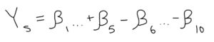
    The system of linear equations is structured so “Y” equals the Net Rating of the home team in stint number “s” in a given game. The variables “A” and “B” are indicators of whether a given player is on the home or away team, respectively, while its first subscript (let’s call it “i”) categorizes a team’s player as a given number and the “s” (the second subscript) numbered stint in which the stint took place.

    To structure these equations to divvy the credit of the outcome of the stint, a player for the home team is designated with a 1, a player for the away team is given a -1, and a player on the bench is a 0 (because he played no role in the outcome of the stint).

    The matrix form of this system for a full game has the home team’s Net Rating for each stint listed on a column vector, which is then set equal to the “player” matrix, or the 1, -1, and 0 designation system we discussed earlier. Because the matrix will likely be non-square it is non-invertible (another indicator is that the determinant of the matrix would equal zero). Thus, the column vector and the player matrix are both multiplied by the transpose (meaning it is flipped across its diagonal, i.e. the rows become columns and the columns become rows) of the player matrix, which gives us a square matrix to solve for the implied beta column vector!

    An example of how a matrix is transposed.

    The new column vector will align the altered player matrix with the traditional Plus/Minus of a given player throughout the game while the new player matrix counts the number of interactions between two players. For example, if the value that intersects players one and six has an absolute value of eight, the two of them were on the floor together (or in this case, against each other) for eight stints. Unfortunately, the altered player matrix doesn’t have an inverse either, which requires the new column vector to be multiplied by the generalized inverse of the new player matrix (most commonly used as the Moore-Penrose inverse). I may take a deeper dive into computing the pseudoinverse of a non-invertible matrix in a future walk-through calculation, but the obligatory understanding of the technique for this example is that it’s an approximation of a given matrix with invertible properties.

    Multiplying by the “pseudoinverse” results in the approximation of the beta coefficients and will display the raw APM for the players in the game. Taken over the course of the season, a player’s APM is a weighted (by the number of possessions) average of a player’s scores for all games, and voila, Adjusted Plus/Minus! This process serves as the foundation for RAPM and, although a “fair” distribution of a team’s performance, it’s far from perfect. Raw APM is, admittedly, an unbiased measure, but it often suffers from extreme variance. This means the approximations (APM) from the model will often strongly correlate with a team’s performance, but as stated earlier, it’s a “best guess” measurement. Namely, if there were a set of solutions that would appease the least-squares regression even slightly less, the scores could drastically change.

    Thanks to the work of statisticians like Jeremias Engelmann (who, in a 2015 NESSIS talk, explained that regular APM will often “overfit,” meaning the model correlates too strongly to the measured response and loses significant predictive power, a main contributor to the variance problem), there are viable solutions to this confoundment.

    (? Towards Data Science)

    Regularized Adjusted Plus/Minus

    Former Senior Basketball Researcher for the Orlando Magic, Justin Jacobs, in his overview of the metric on Squared Statistics, outlined a set of calculations for APM in a three-on-three setting, obtaining features similar to the ones that would usually be found.

    (? Squared Statistics)

    Although the beta coefficients were perfectly reasonable estimators of a team’s Net Rating, their variances were astoundingly high. Statistically speaking, the likelihood that a given player’s APM score was truly reflective of his value to his team would be abysmal. To mitigate these hindrances, statisticians use a technique known as a “ridge regression,” which involves adding a very mild perturbation (“change”) to the player interaction matrix as another method to approximate the solutions that would have otherwise been found if the matrix were invertible.

    We start with the ordinary least-squares regression (this is the original and most commonly used method to estimate unknown parameters):

    This form is then altered as such:

    Note: The “beta-hat” indicates the solution is an approximation.

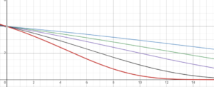
    The significant alterations to the OLS form are the additions of the lambda-value and an identity matrix (a square matrix with a “1” across its main diagonal and a “0” everywhere else; think of its usage as multiplying any number by one. Similar to how “n” (a number) * 1 = n, “I” (the identity matrix) * “A” (a matrix) = A). The trademark feature of the ridge regression is its shrinkage properties. The larger the lambda-value grows, the greater the penalty and the APM scores regress closer towards zero.

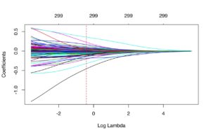
    (? UC Business Analytics – an example of shrinkage due to an increase in the lambda-value, represented by its (implied) base-10 logarithm)

    With the inclusion of the perturbation to the player interaction matrix, given the properties listed, we have RAPM! However, as with raw APM, there are multiple sources of confoundment. The most damning evidence, as stated earlier, is that we’re already using an approximation method, meaning the “most likely” style from APM isn’t eliminated with ridge regression. If the correlation to team success were slightly harmed, the beta coefficients could still see a change, but not one nearly as drastic as we’d see with regular APM.

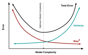
    There’s also the minor inclusion of bias that is inherent with ridge regression. The bias-variance tradeoff is another trademark in regression analysis with its relationship between model complexity. Consequently, the goal will often be to find the “optimal” model complexity. RAPM is a model that introduces the aforementioned bias, but it’s such a small inclusion it’s nearly negligible. At the same time, we’re solving the variance problem! It’s also worth noting the lambda-value will affect the beta coefficients, meaning a player’s RAPM is best interpreted relative to the model’s lambda-value (another helpful tidbit from Justin Jacobs).

    (? Scott Fortmann-Roe)

    My concluding recommendations for interpreting RAPM include: 1) Allow the scores to have time to stabilize. Similar to points per game or win percentage, RAPM varies from game-to-game and, in its earlier stages, will often give a score that isn’t necessarily representative of a player’s value. 2) Low-minute players aren’t always properly measured either. This ties into the sample-size conundrum, but an important aspect of RAPM to consider is that it’s a “rate stat,” meaning it doesn’t account for the volume of a player’s minutes. Lastly, as emphasized throughout the calculation process, RAPM is not the exact correlation between the scoreboard and a player’s presence. Rather, it is an estimate. Given sufficient time to stabilize, it eventually gains a very high amount of descriptive power.

    Regression Models

    RAPM may be a helpful metric to use in a three or five-year sample, but what if we wanted to accomplish the same task (estimate a player’s impact on his team every 100 possessions he’s on the floor) with a smaller sample size? And how does all this relate to the metrics commonly used today, like Box Plus/Minus, PIPM, and LEBRON? As it turns out, they are the measurements that attempt to answer the question I proposed earlier: they will often replicate the scores (to the best of their abilities) that RAPM would distribute without the need for stabilization. Do they accomplish that? Sometimes. The sole reason for their existence is to approximate value in short stints, but that doesn’t necessarily mean they need some time to gain soundness.

    Similar to our exercise with a general impact metric, which uses any method to estimate value, let’s define the parameters of a “regression model” impact metric:

    A regression model is a type of impact metric that estimates RAPM over a shorter period of time than needed by RAPM (roughly three years) using a pool of explanatory variables that will vary from metric to metric.

    The idea is fairly clear: regression models estimate RAPM (hence, why scores are represented through net impact every 100 possessions). But how do they approximate those values? These types of impact metrics use a statistical technique named the multiple linear regression, which fulfills the goal of the regression model by estimating a “response” variable (in this case, RAPM) using a pool of explanatory variables. This will involve creating a model that takes observed response values (i.e. preexisting long-term RAPM) and its correlation with the independent variables used to describe the players (such as the box score, on-off ratings, etc.).

    (? Cross Validated – Stack Exchange)

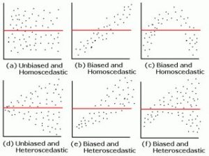
    Similar to the “line of best fit” function in Google Sheets that creates forecast models for simple (using one explanatory variable) linear regressions, the multiple linear regression creates a line of best fit that considers descriptive power between multiple explanatory variables. Similar to the least-squares regression for APM, a regression model will usually approximate its response using ordinary least-squares, setting forth the same method present in the RAPM segment that is used to create the perturbation matrix. However, this isn’t always the case. Metrics like PIPM use a weighted linear regression (AKA weighted least squares) in which there is a preexisting knowledge of notable heteroscedasticity in the relationship between the model’s residuals and its predicted values (in rough layman’s terms, there is significant “variance” in the model’s variance).

    (The WLS format – describing the use of the residual and the value predicted from the model.)

    WLS is a subset of generalized least squares (in which there is a preexisting knowledge of homoscedasticity (there is little to no dispersion among the model’s variance) in the model), but the latter is rarely used to build impact metrics. Most metrics will follow the traditional path of designating two data sets: the training and validation data. The training data is used to fit the model (i.e. what is put into the regression) while the validation data evaluates parts like how biased the model is and assuring the lack of an overfit. If a model were trained to one set of data and not validated by another set, there’d be room to question its status as “good” unless verified at a later date.

    After the model is fitted and validated, an impact metric has been successfully created! Unfortunately (again…), we’re not done here, as another necessary part of understanding impact metrics is a working knowledge of how to assess their accuracy.

    Evaluating Regression Models

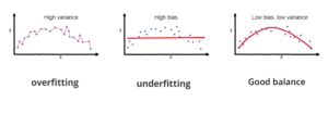
    While the formulations of a lot of these impact metrics may resemble one another, that doesn’t automatically mean similar methods produce similar outputs. Intuitively speaking, we’d expect a metric like PIPM or RAPTOR, which includes adjusted on-off ratings and tracking data, to have a higher descriptive power compared to a metric like BPM, which only uses the box score. Most of the time, our sixth sense can pick apart from the good from bad, and sometimes the good and the great, but simply skimming a metric’s leaderboard won’t suffice when evaluating the soundness of its model.

    The initial and one of the most common forms of assessing the fit of the model includes the output statistic “r-squared” (R^2), also known as the coefficient of determination. This measures the percent of variance that can be accounted for in a regression model. For example, if a BPM model has an R^2 of 0.70, then roughly 70% of the variance is accounted for while 30% is not. While this figure serves its purpose to measure the magnitude of the models’ fit to its response data, a higher R^2 isn’t necessarily “better” than a lower one. A model that is too reliant on its training data loses some of its predictive power, as stated earlier, falling victim to a model overfit. Thus, there are even more methods to assess the strength of these metrics.

    (? InvestingAnswers)

    Another common and very simple method could be to compare the absolute values of the residuals of the model’s scoring between the training data and the validation data (we use the absolute values because ordinary least-squares is designed so the sum of the residuals will equal zero) to assess whether the model is equally unbiased toward the data it isn’t fitted to. Although this may be a perfectly sound technique, its simplicity and lack of comprehension may leave the method at a higher risk of error. Its place here is more to provide a more intelligible outlook on evaluating regression models. Similarly, we’ll sometimes see the mean absolute error (MAE) of a model given with the regression details as a measure of how well it predicts those original sets of data.

    There’s also the statistical custom of assessing a metric’s residual plot, which compares the model’s predicted value and its residual (observed value minus predicted value) on the x and y-axes, respectively, on a two-dimensional Cartesian coordinate system (AKA a graph). If there is a distinct pattern found within the relationship between the two, the model is one of a poorer fit. The “ideal” models have a randomly distributed plot with values that don’t stray too far from a standardized-zero. Practically speaking, the evaluation of the residual plot is one of the common and viable methods to assessing how well the model was fit to the data.

    (? R-bloggers)

    However, as seen in works from websites like Nylon Calculus and Dunks & Threes, the most common form of impact metric evaluation in the analytics community is retrodiction testing. This involves using minute-weighted stats from one season used to predict the next season. For example, if Cornelius Featherton was worth +5.6 points every 100 possession he was on the floor during the 2019 season and played an average of 36 minutes per game in the 2020 season, his comparison score would equate to roughly +4.2 points per game. This would be used to measure the errors between a team’s cumulative score (i.e. an “estimated” SRS) against the team’s actual SRS. Evidently, this method suffers from the omission of ever-changing factors like a player’s improvements and declinations, aging curves, and yearly fluctuations, it does hold up against injury and serves a purpose as a measure of predictive power. (“A good stat is a predictive stat” – a spreading adage nowadays.)

    Basketball analytics and impact metrics may appear to be an esoteric field at times – I certainly thought so some time ago – but the comprehension of its methodologies and principles isn’t full of completely unintelligible metric designs and reviews. Hopefully, this post served as a good introductory framework to the models and philosophies of the numbers we adore as modern analysts or fans, and that it paints a somewhat clear picture of the meanings behind impact metrics.